01 BLUF
The Bottom Line:
- Designed and built a new customer support system while improving the existing platforms.
- Heavy shadowing and research led to clear, actionable efforts that significantly improved performance.
- Work from this project evolved into a 30-tool supporting design system across multiple platforms and languages.
02 The Team
- Ben Getson: Product Management
- John Athayde: UX, Visual Design, CSS
- Lynn Wallenstein: HTML/CSS/Rails, UX
- Tom Copeland: Engineering
- Dave Bock: Engineering
- Pete Campbell: Engineering
03 The Details
LivingSocial was a daily deals company that experienced exponential growth in the early 2010s. As with many fast-growing startups, customer service issues popped up due to elements of the product offering that were unknown or didn't scale as well as the team would have liked.
By 2012, we experienced expectation mismatches between customers and merchants, issues where merchants did not always abide by the terms of the agreement, and some customers who abused the system.
As a recently created internal tools team, helping customer support was one of our first tasks. Through interviews and shadowing of CSRs (Customer Support Representatives), we discovered a variety of issues:
- Low KPIs and SLAs: Agent average SLA was 20%,
- One in five calls hung up before a representative could even answer the phone,
- Consumer cases took a long time, and sometimes multiple calls, to close,
- CSRs entered all data into two systems: A Ruby on Rails CRUD interface to our admin area and Salesforce (case management).
- Due to that, CSRs spent more time documenting the call than the call itself.
- Many one-off issues required an engineer to make edits in the production database manually.
- Poor SOPs around rebates caused a lot of confusion about what a CSR could offer a customer on a call and led to uneven outcomes for similar issues.
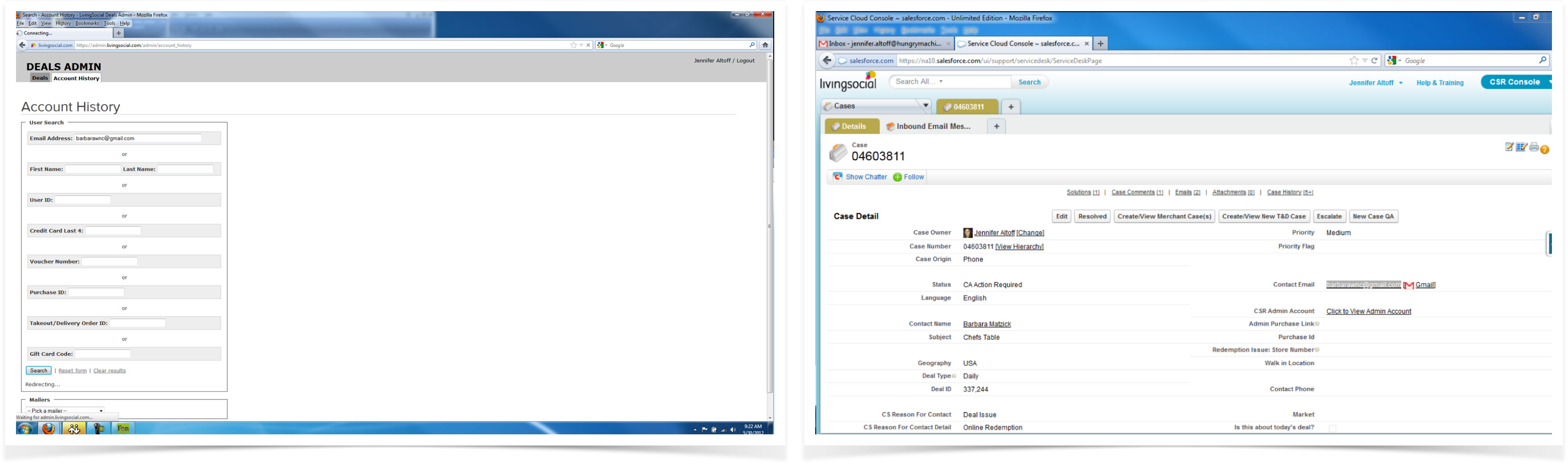
The system at project inception. Double-entry in Salesforce and Admin areas.
CSRs would communicate through AIM, Salesforce Chatter, and in person, so many details about cases would not end up in the system of record, and this could lead to handoff issues if someone else picked up an open ticket.
We used a Service Safari to discover issues in the platform. Almost every employee also was a customer, and we started collecting problems identified by employees whose deals didn't quite work out as expected.
We began by interviewing managers and line support representatives and following up with extensive and regular shadowing of CSRs on both phone calls and email support cases. These developed into medium-weight personas for our primary groups in the support organization.
We used the AT-ONE framework to analyze the overall service and look for improvements. AT-ONE stands for "Actors, Touchpoints, Offering, Need, and Experiences."
A primary challenge was that we had to roll out the new interactions for a subset of CSRs while maintaining the old system. Engineering selected Salesforce as the database of record, and engineers had to write a library for the new Ruby/Backbone app to talk to it.
We used hand sketching followed by high-fidelity comps to fix individual, minor problems in the existing interface while we worked towards a new holistic system. Some examples:
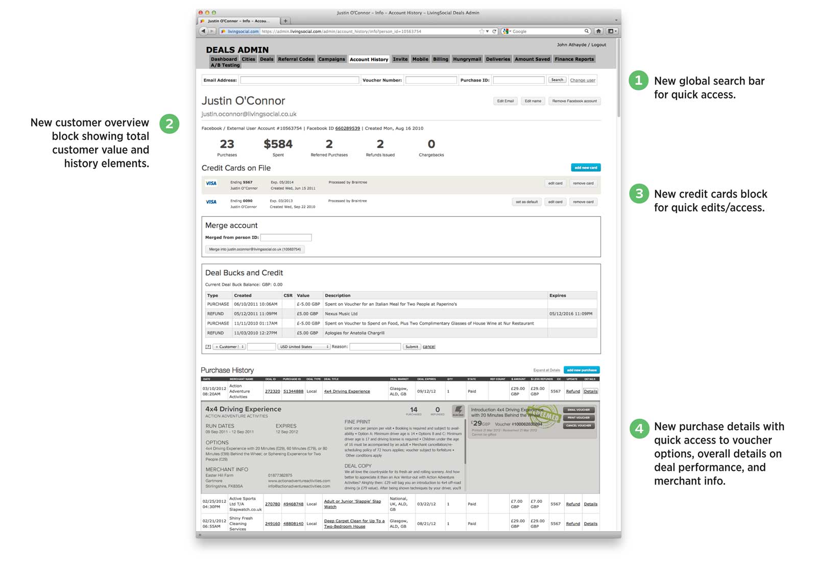
Elements such as subscription management, user overview, user creditcards, voucher detail, and more were all introduced into the old interface before the new product was complete.
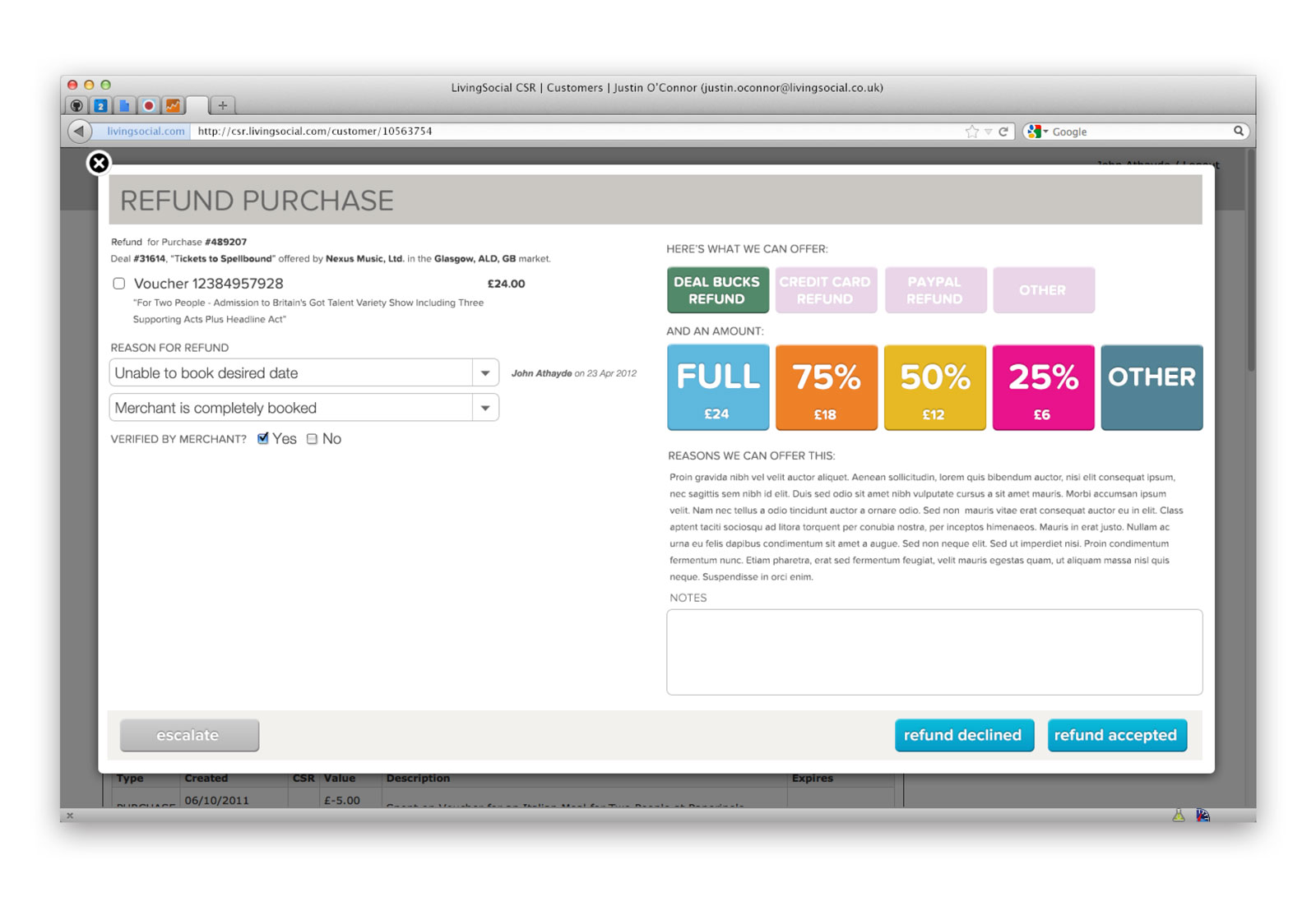
The new refund workflow in the old admin area. This was the first major "new look" block that really took over the page and hinted at the new "Q" app coming.
During this process, we identified several items that we brought to the Consumer design & engineering team and collaborated on those improvements:
- We improved the deal's fine print, shifting to bullet points for improved legibility and making phrasing more explicit.
- The consumer team redesigned the voucher itself to improve clarity for the purchaser.
- Consumer engineering built an entire self-service portal to fast-track typical support reasons and provide immediate resolution
- We changed microcopy in the global navigation from "My Account" to "My Vouchers"
- The Deal Quality & Programming team took feedback about various merchants and altered offerings to reduce customer frustration.
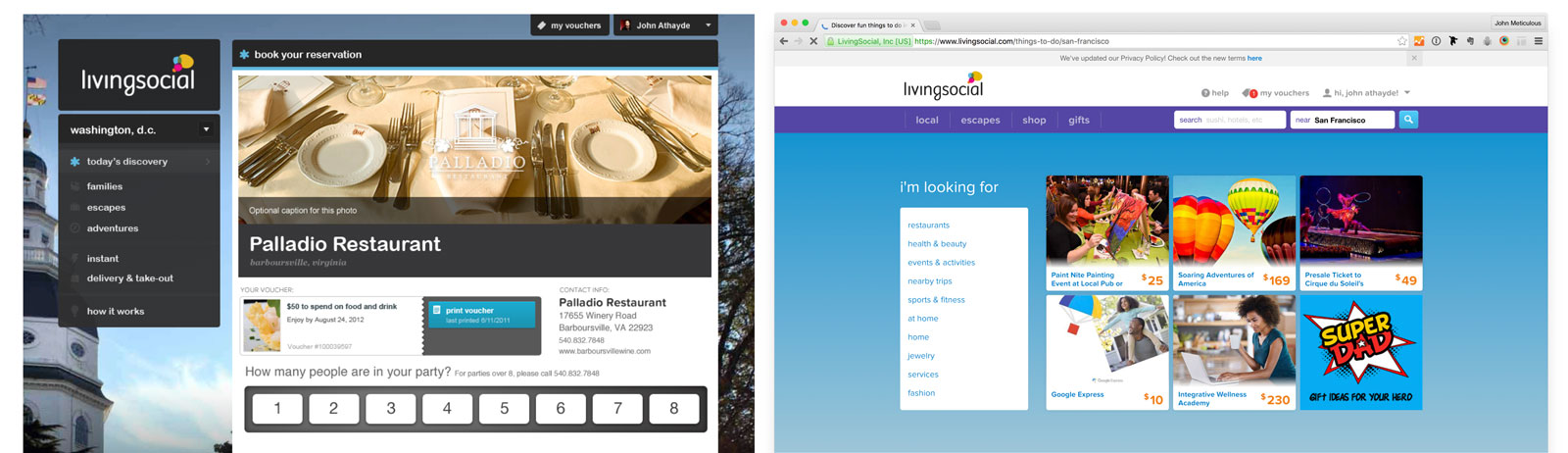
The new "My Vouchers" tab change on the consumer side, in the original and redesigned interfaces (design & implementation by customer design/engineering teams).
After launch, we measured the following improvements:
- Agent SLA improved from 20% to 90%
- The call abandonment rate dropped from 20% to 4%
- We reduced the time for a CSR to complete a consumer case by 20%
The design elements created for this became the backbone of the style guide/design system ("Wilde") that powered 30 different internal tools with a UX/Front-end team of four people I led as a player-coach.
Here are the final screen designs:
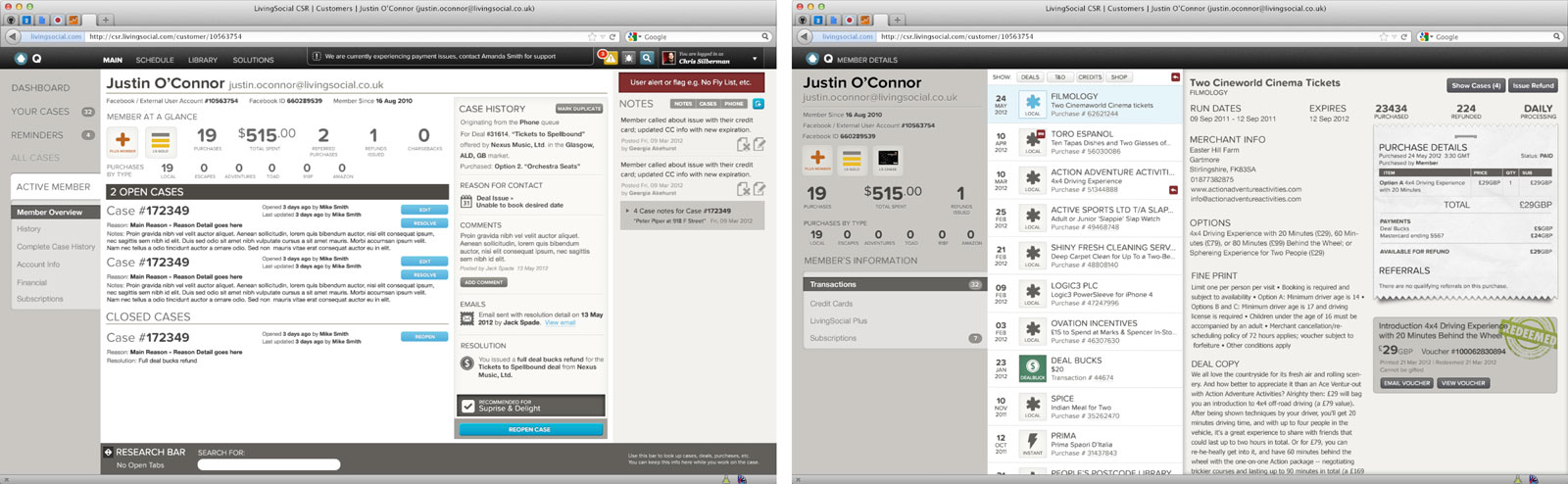
Teh dual screen setup most CSRs would be seeing during regular interactions.
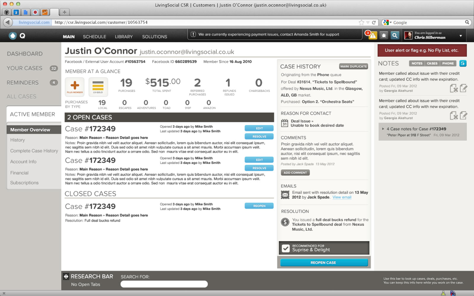
New primary screen (left monitor).
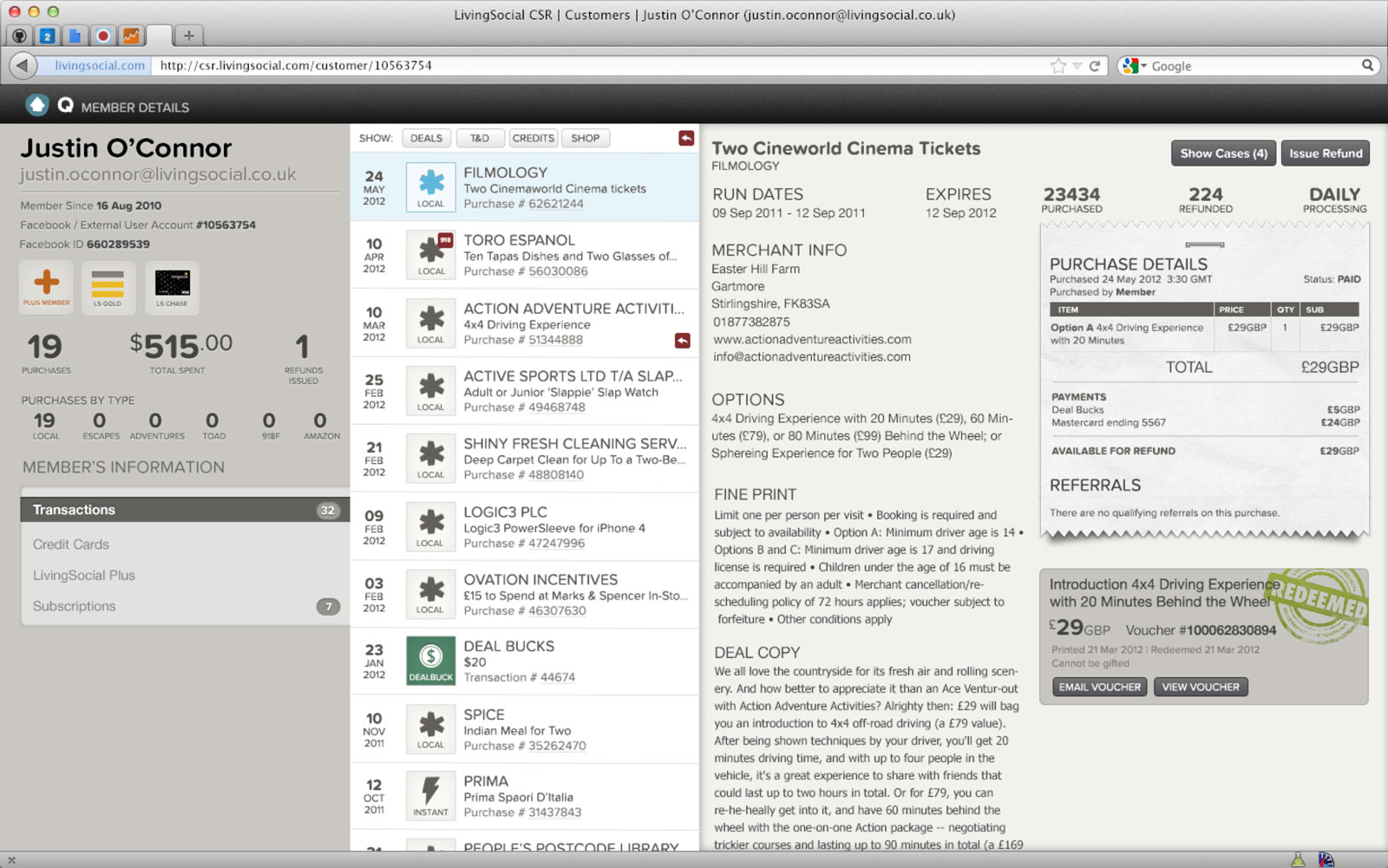
New primary transactions view for a customer (right monitor).
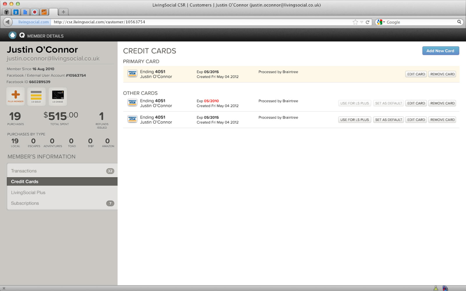
New credit card view for a customer (right monitor).
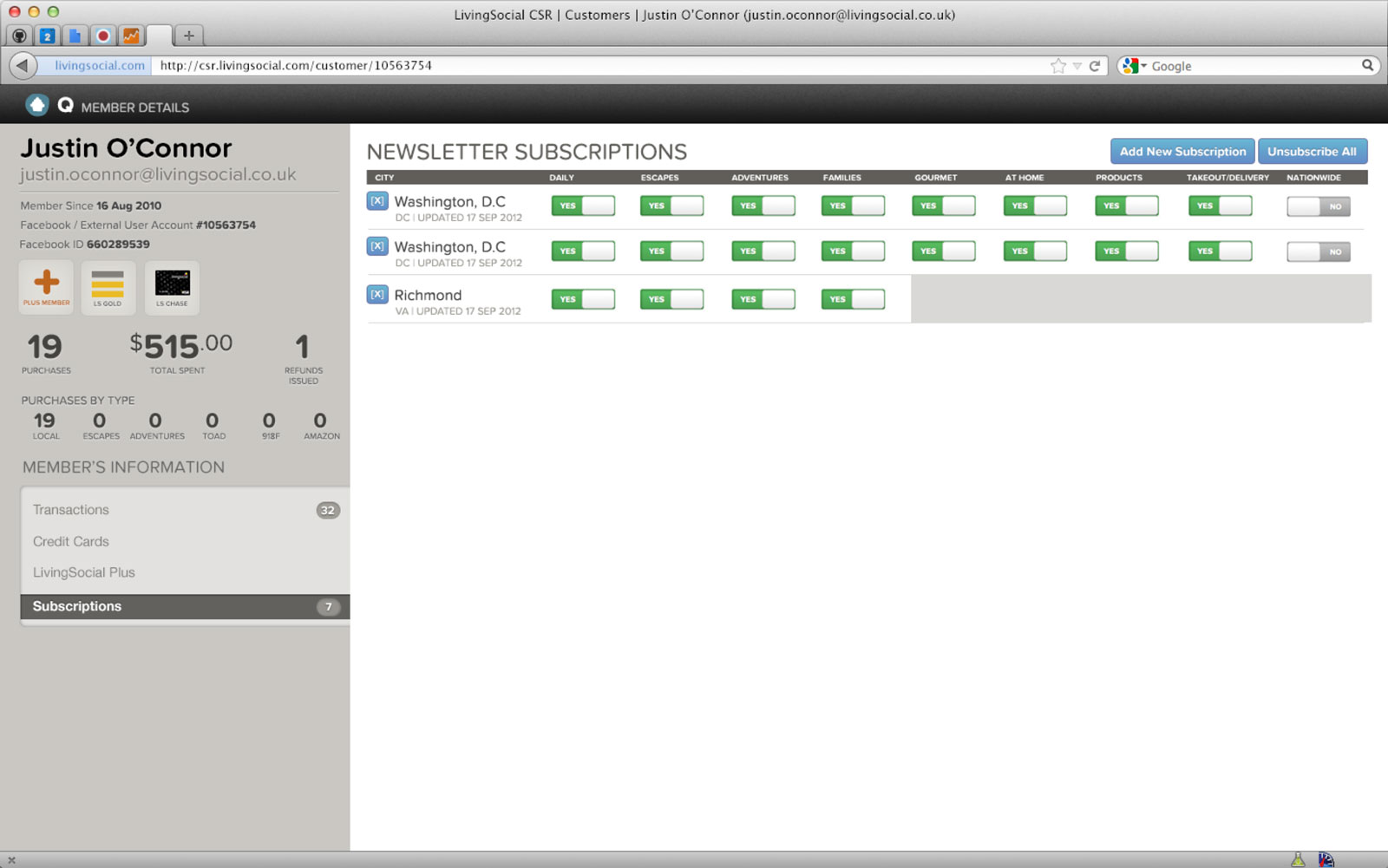
New subscriptions view for a customer (right monitor).